
Case study
A portfolio built in Framer, made interactive with code
Shifat Masud’s portfolio: a no-code site that behaves like a hand-coded WebGL one, and stays editable by anyone in Framer.
Role
Design and code, solo
Built with
Framer and small React code components
Breakpoints
Desktop, tablet, phone
Live
shifatmasud.framer.website
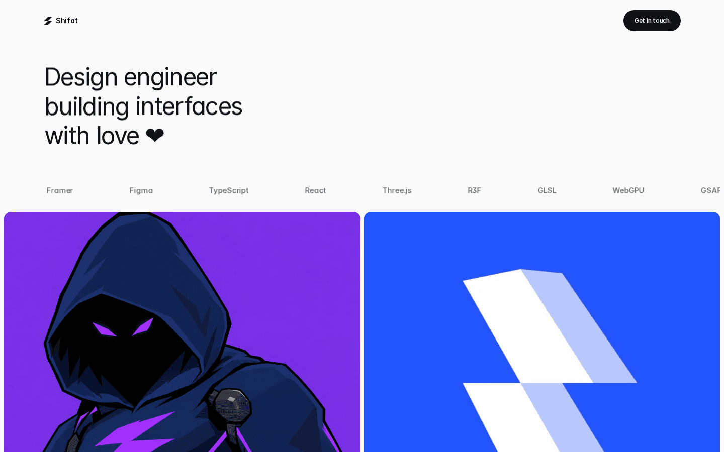
The portfolio this page describes.
How to use this page
Read it as a build spec
This page is a skill file for building a site the way Shifat builds. Every section is an instruction, in the order you should do it. Follow it literally. When a rule here conflicts with your habit, the rule wins.
Goal: a Framer site that feels hand-coded, where every word, colour and image stays editable by a no-coder. Layers are native. Behaviour is small code components that render nothing.
The problem
Static mockups, locked-in builds
Portfolio mockups are static. Making one fully interactive usually means leaving the no-code tool, and then nobody but the developer can change it.
The goal here was both: the feel of a hand-coded site, with every word, colour and image still editable in Framer.
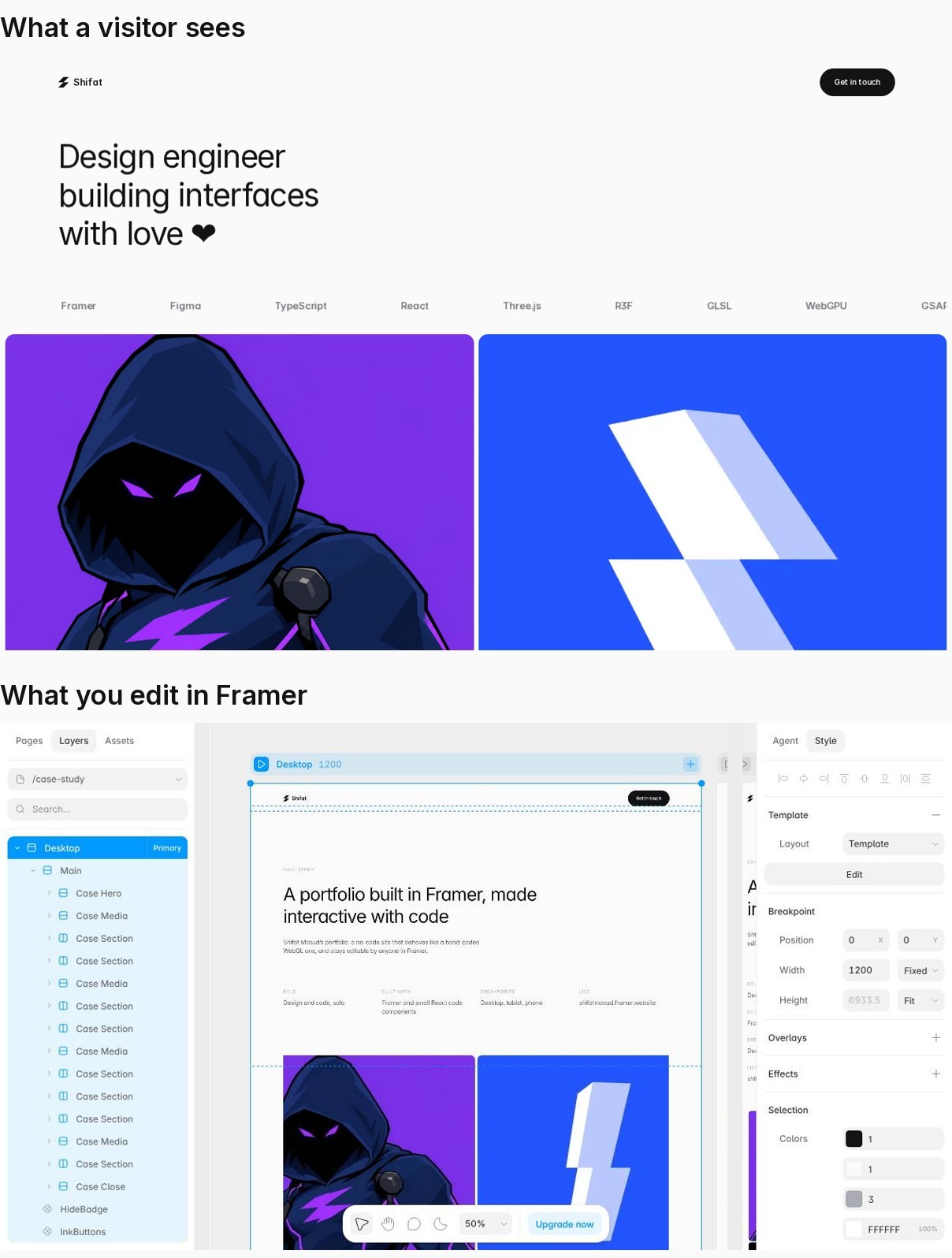
Left: the live site a visitor sees. Right: the same page as plain layers and styles in Framer. That is the brief: hand-coded feel, no-code editing.
Approach
Native layers, behaviour in code
—
Everything visible is a native Framer layer with a meaningful name: text, tiles, tags, nav. Copy, colour and images stay editable.
—
Behaviour lives in small code components that render nothing and attach to layers by name: tile stroke animation, marquee, text reveal, word light, particle logo, ink buttons. Each does one job.
—
Media is native too. Tile art and the two animated tiles are plain image fills, with no code attached.
—
Brand: Inter only, Phosphor icons, paper #fafafa, ink #121315.
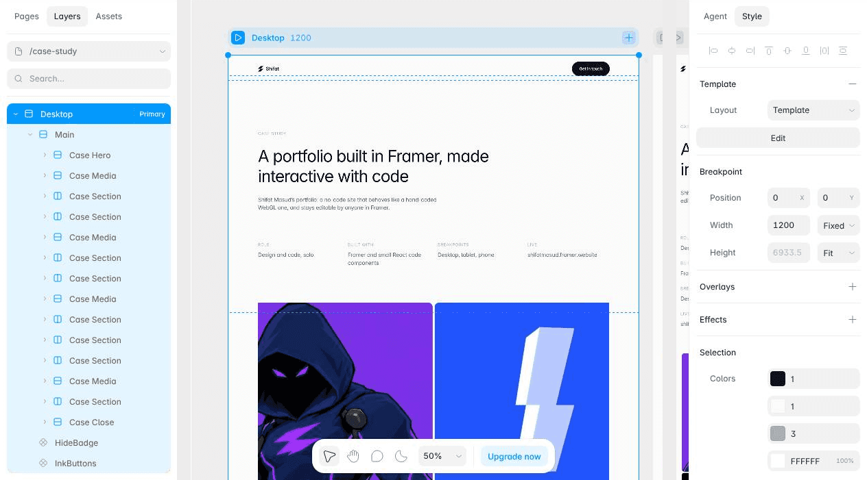
Every block is a named layer with a shared text style. Anyone can edit it here.


Plain animated image fills inside the card component. No code touches the media.
Code components
Small, scoped, invisible
Each behaviour is a React 18 code component that renders nothing. It finds layers by their data-framer-name (Tile, Accent, Tile Card), so a designer can restyle or move layers and the behaviour follows.
One component, one job: TileWave draws the card strokes, TextReveal does the masked slide-ups, WordLight fills ink as you scroll, InkButtons animates buttons. Every one skips the canvas and exposes its numbers as property controls.
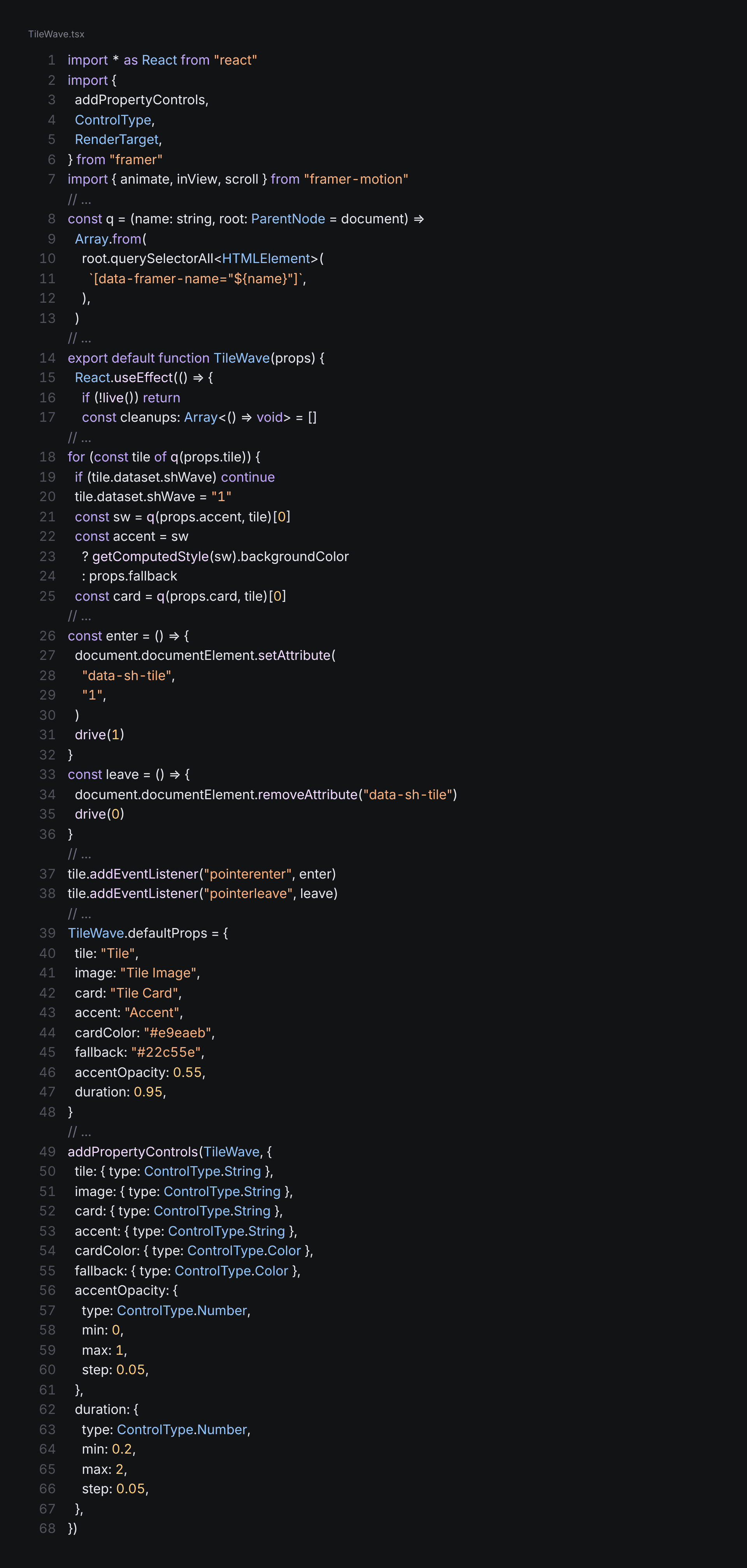

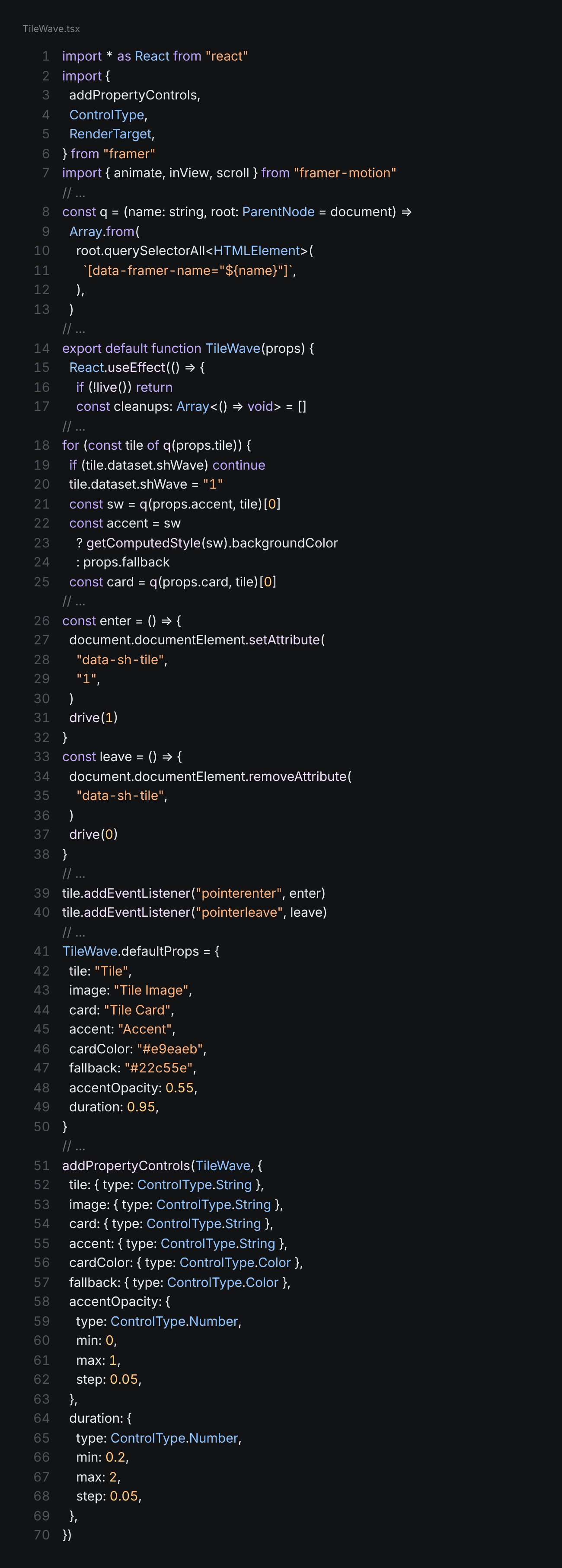
The whole contract of a behaviour: find layers by name, skip the canvas, render nothing.
Layer contract
Name layers; code finds them
Rule: a code component never builds visible UI. It looks up layers by data-framer-name and animates them. Name the layers exactly, or the behaviour will not attach.
Tile > Accent (colour source) + Tile Card (revealed content): TileWave strokes.
Marquee Track: two identical native sets, translated in a loop.
Quote Text: WordLight fills ink line by line on scroll.
Logo Cloud: ParticleLogo draws the footer mark in WebGL2.
Button instance + one InkButtons instance per page: ink fill on hover.
Every component: skip RenderTarget.canvas, expose numbers as property controls, respect prefers-reduced-motion, clean up listeners, and render a 1px invisible Ghost. One component, one job.
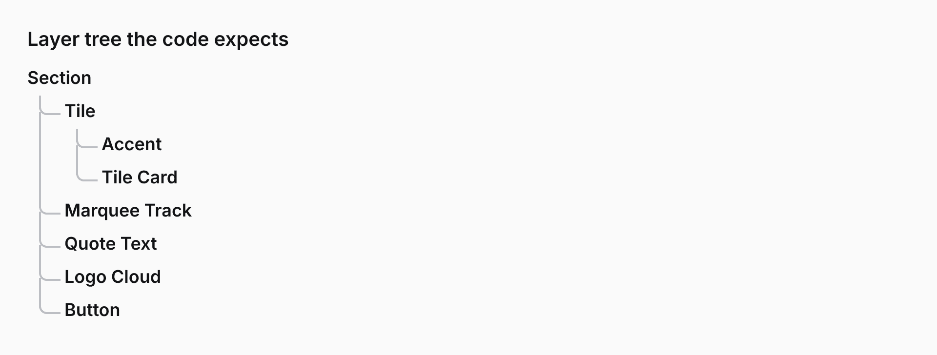
The exact layer names each behaviour looks for. Rename one and the behaviour stops.
Text and colour styles
One change, every breakpoint
Type is Inter only, set once as text styles: display, title, body and label sizes. Colours are colour styles: paper, surface, ink, muted and line. Layers reference the style, never a raw value.
Tokens: paper #FAFAFA, surface #F2F3F4, ink #121315, muted #5F646B, line #E9EAEB. Text styles: Display/XL 88 on 1.04, Title/M 28 on 1.2, Body/L 16 on 1.45, Label/S 12 on 1.4. Change a style once and desktop, tablet and phone all update.
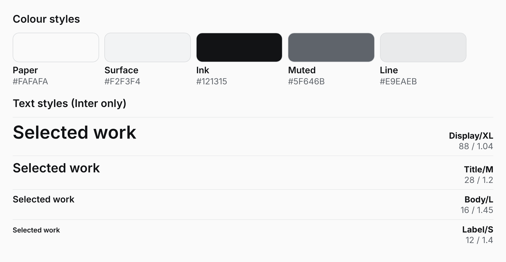
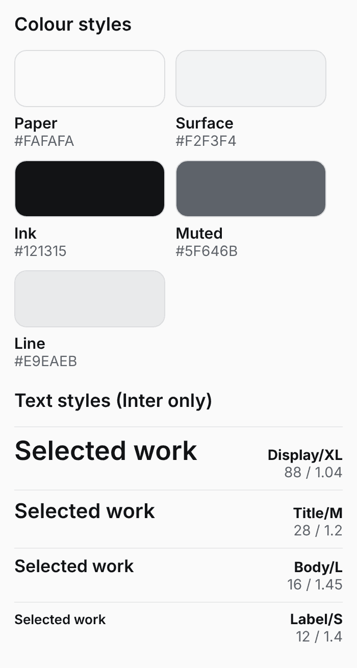
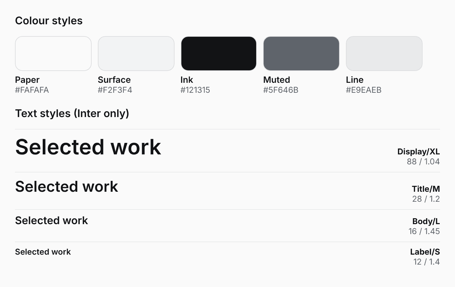
The real palette and type scale, each defined once as a style.
The project card
Iterated until it felt right
01
Started as a soft image reveal. It felt generic.
02
Rebuilt as stroked path draws: an accent S curve, then a flipped grey S, then a wipe.
03
Removed the blurry panel behind the text and the cursor smear over cards, so the card is only strokes.
04
Each card’s first stroke got its own colour: violet, hot pink, white, orange, cyan, lime. Strokes thicken as they sweep.
05
Two tiles now loop short animations, set as plain image fills.
Looping demo of the real hover: the cursor sweeps each card and a stroke draws in its own colour. The stroke is the only code here.
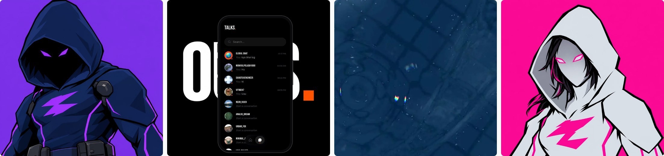
Four of the six cards mid-sweep. Each opens in its own colour.
Motion
Quiet, deliberate, no fades
The preloader counts up, morphs a mark into an S, slides it into a slanted rectangle, squares it and zooms into the page. Nothing on the page animates until it finishes.
Text reveals are masked slide-ups, never fades. The contact section is sticky at the bottom, so the page slides over it like a curtain.
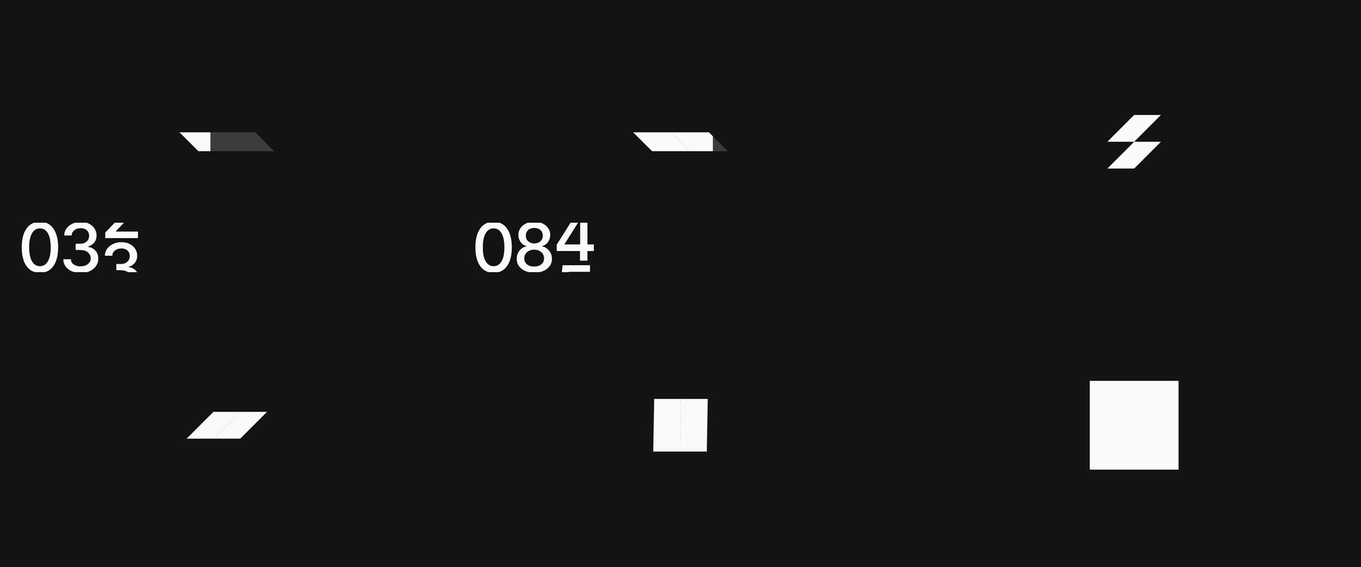
Read left to right, top to bottom. One shape hands off to the next.
Touch
Hover becomes scrub
—
On touch, hover maps to scrub: a finger dragging over a tile plays the card.
—
Lifting the finger, or leaving the tile, restores the default state.
—
A tap still opens the project, a drag never does, and vertical scrolling is never blocked.
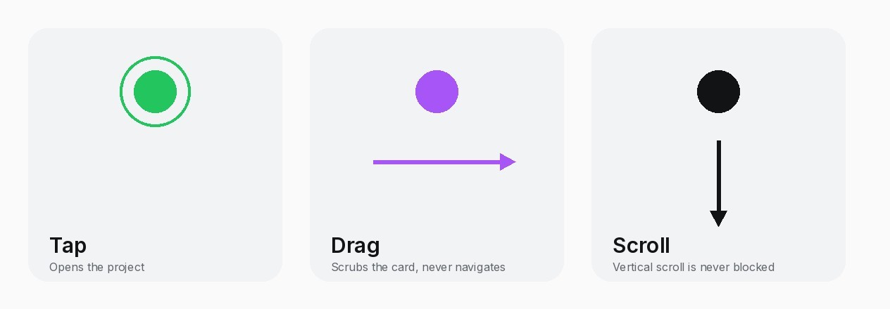
Three gestures, three outcomes. Only a tap navigates.
Accessibility
Checked, not assumed
—
Contrast audit: the one failing text style (2.16:1) now passes at 5:1 or better.
—
Reduced motion turns effects off; cards show as solid panels.
—
All image fills have alt text.
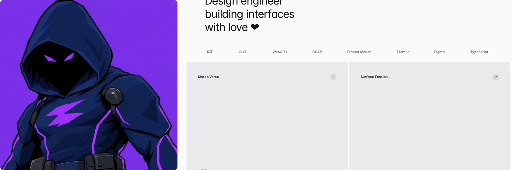
Keyboard focus on the home page, and the cards as solid panels under reduced motion.
Hard rules
Do this, never that
Do: Inter only. Phosphor icons. Native layers with meaningful names. Text and colour styles for everything. Masked slide-up reveals. Button labels Inter Medium 500. Sticky and curtain footers with native Framer sticky only. Every reload starts at scroll top. Alt text on every image.
Never: emojis in the design. Fade or blur text reveals. Code components for media: images and animated WebP are plain image fills. Custom cursors on the portfolio. Page animation before the loader finishes. Sticky or curtain behaviour in code. Two jobs in one component.
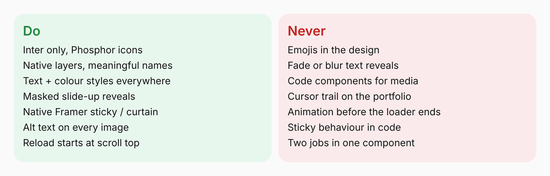
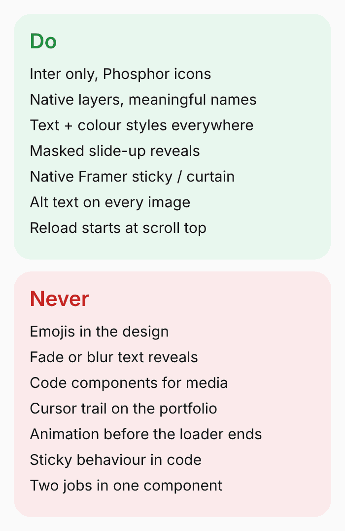
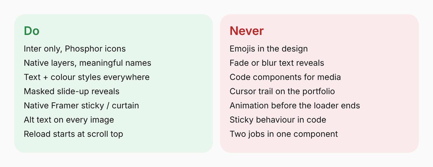
The short version of every rule above.
Responsive
Three breakpoints, one system
Desktop, tablet and phone are separate breakpoints. Type scales through shared text styles, and the tile grid, spacing and footer reflow at each.
I checked the live site by scrolling the whole page at 1440, 1024, 810 and 390 wide, in headless Chrome. Real-device testing is still to do.
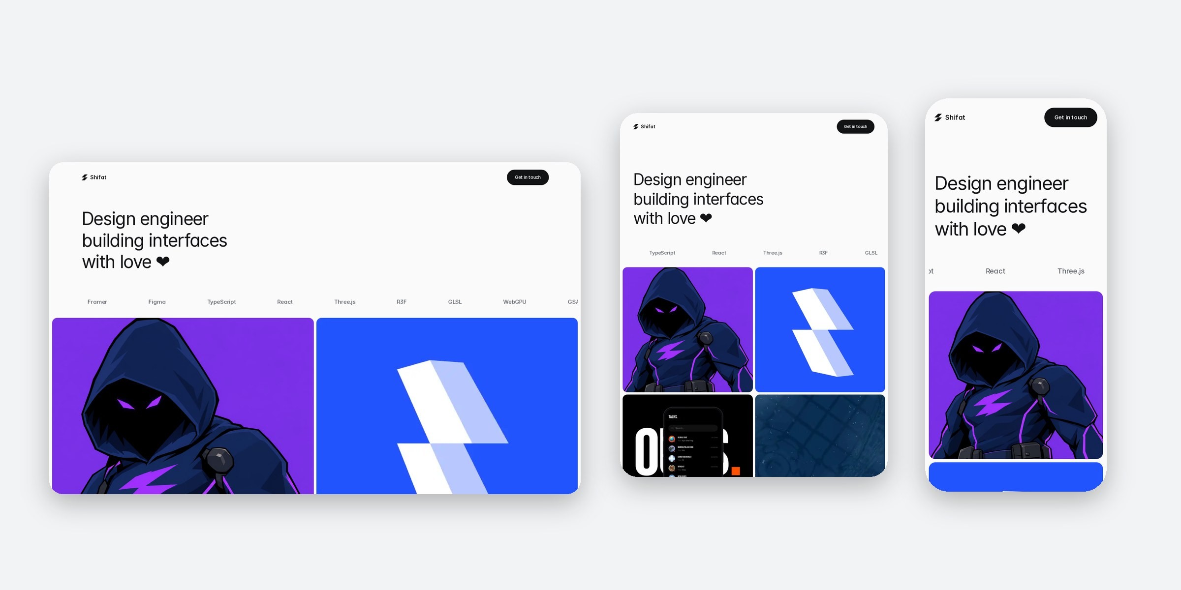
The same page at desktop, tablet and phone.
Build order
Do the steps in this order
1 Set colour and text styles. 2 Build one breakpoint with native layers and shared layout. 3 Duplicate to tablet and phone, fix overrides on the replicas. 4 Name every layer that code will target. 5 Add one code component at a time and test it alone. 6 Add the loader last, and hold all page animation until it ends. 7 Publish.
Gotcha: replica breakpoints override the parent. If something works on desktop and not on tablet or phone, edit the replica node itself. Media blocks need fixed pixel heights per breakpoint. Republish after every change.
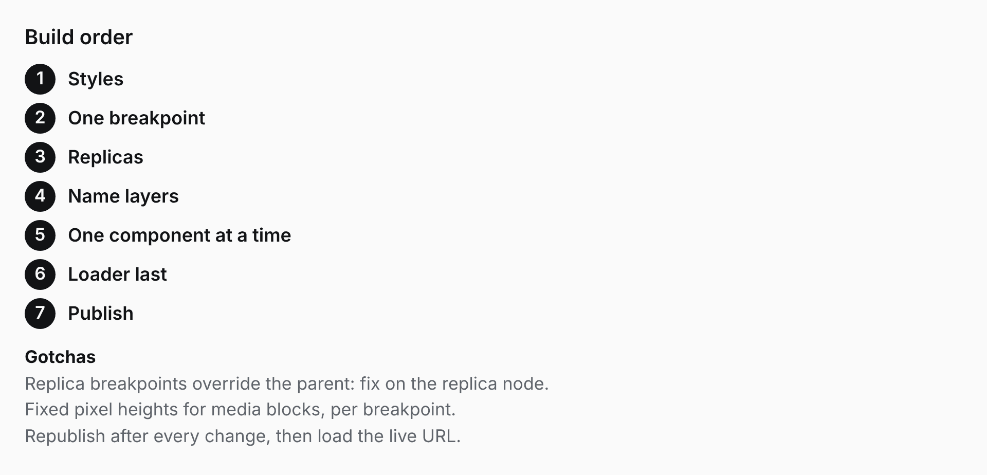
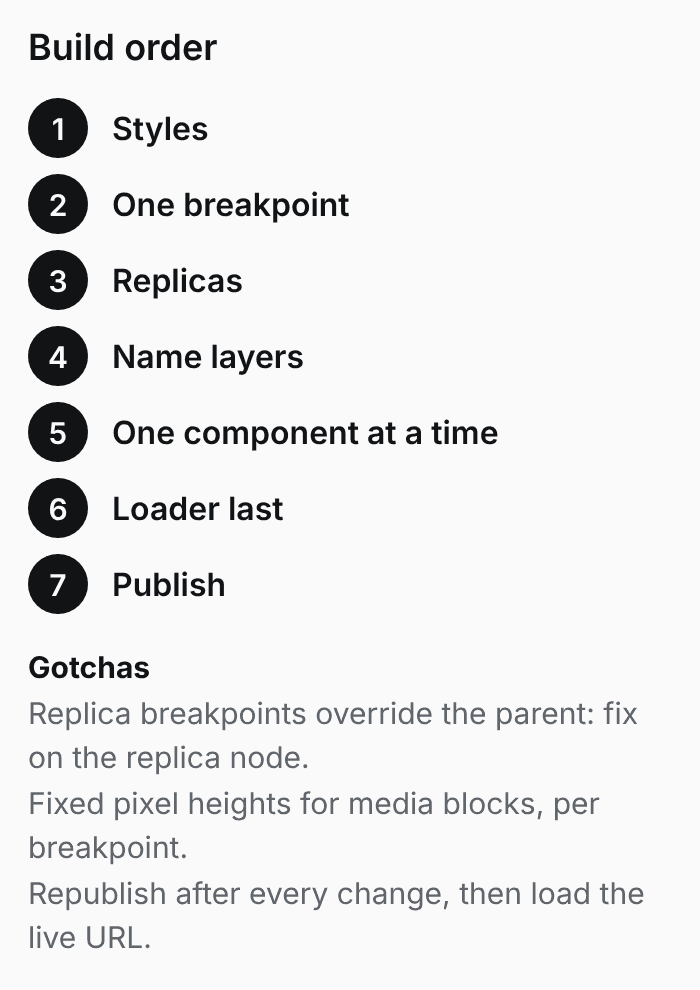
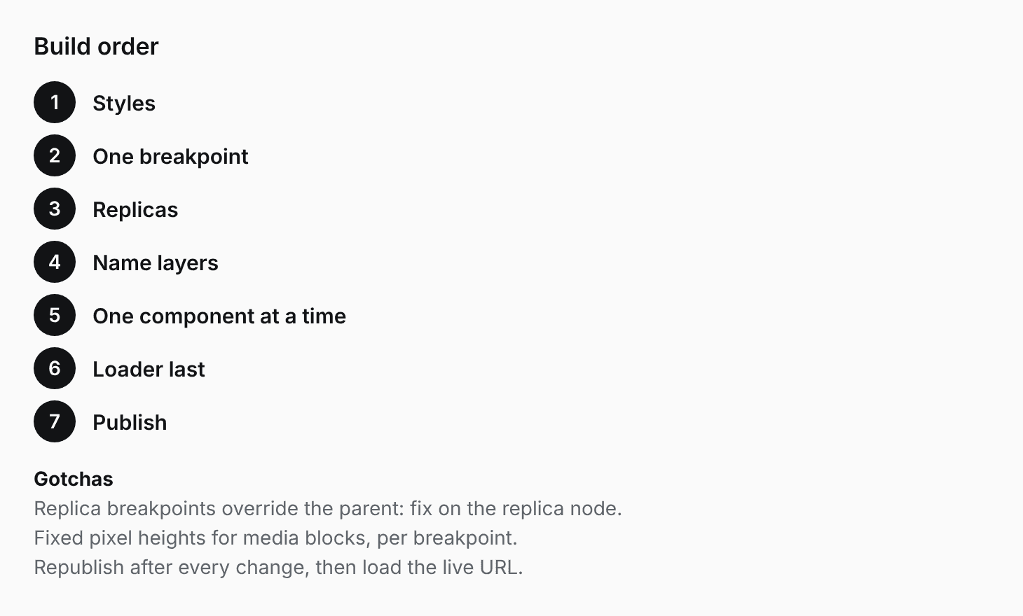
Seven steps, in this order.
Verify
Check before you call it done
Scroll the live page at 1440, 1024, 810 and 390 wide: no horizontal overflow, no console errors. Tab through with the keyboard. Turn on reduced motion and confirm cards fall back to solid panels. Run contrast on every text style (target 4.5:1 or better).
Be honest about what was tested. Headless Chrome is not a phone, Safari or Firefox. Say what was checked and what was not. Say live only after loading the published URL.
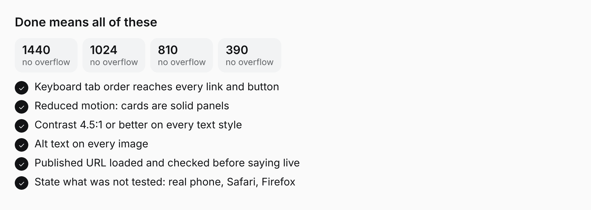
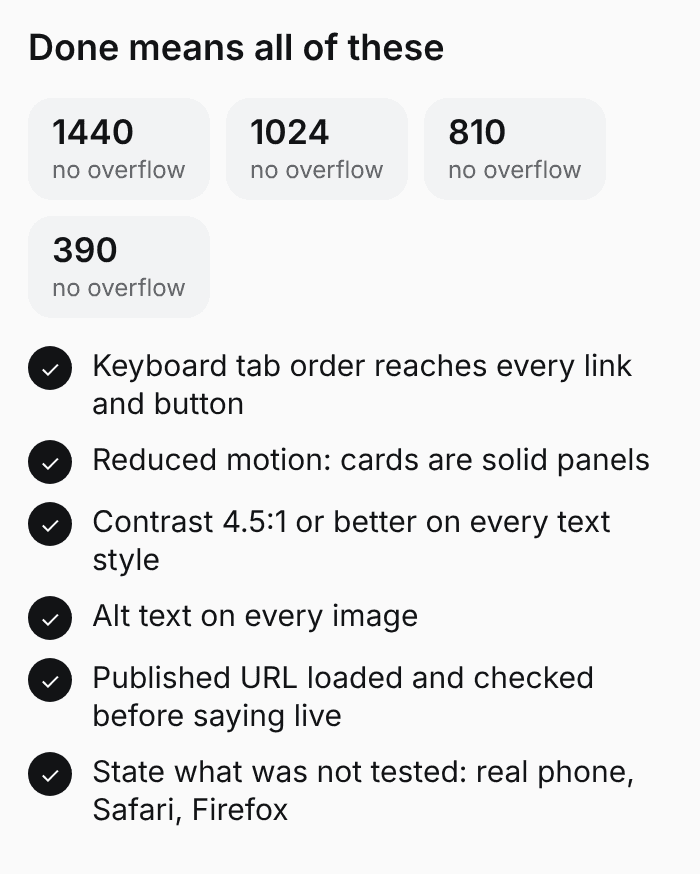
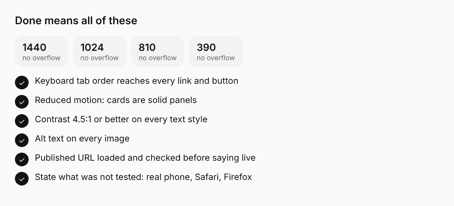
The checks that count as done.
© Shifat Masud 2026
X
GitHub